2018
Client
Moringa Digital & Uber
Moringa Digital & Uber
Team
Wallison Borges — Senior Designer at Moringa Digital
Bruno Mendes — Senior Designer at Moringa Digital
Isabella Barbosa — UI/UX Designer
Renato Carvalho — Project Owner at Moringa Digital
Wallison Borges — Senior Designer at Moringa Digital
Bruno Mendes — Senior Designer at Moringa Digital
Isabella Barbosa — UI/UX Designer
Renato Carvalho — Project Owner at Moringa Digital
Awards
Prêmio Colunistas | Inovação — Ouro — 2019
Prêmio Colunistas | Grande Prêmio de Peça de Mídia Digital — 2019
Prêmio Colunistas | Inovação — Ouro — 2019
Prêmio Colunistas | Grande Prêmio de Peça de Mídia Digital — 2019
UI Design · Workshop Facilitation
What
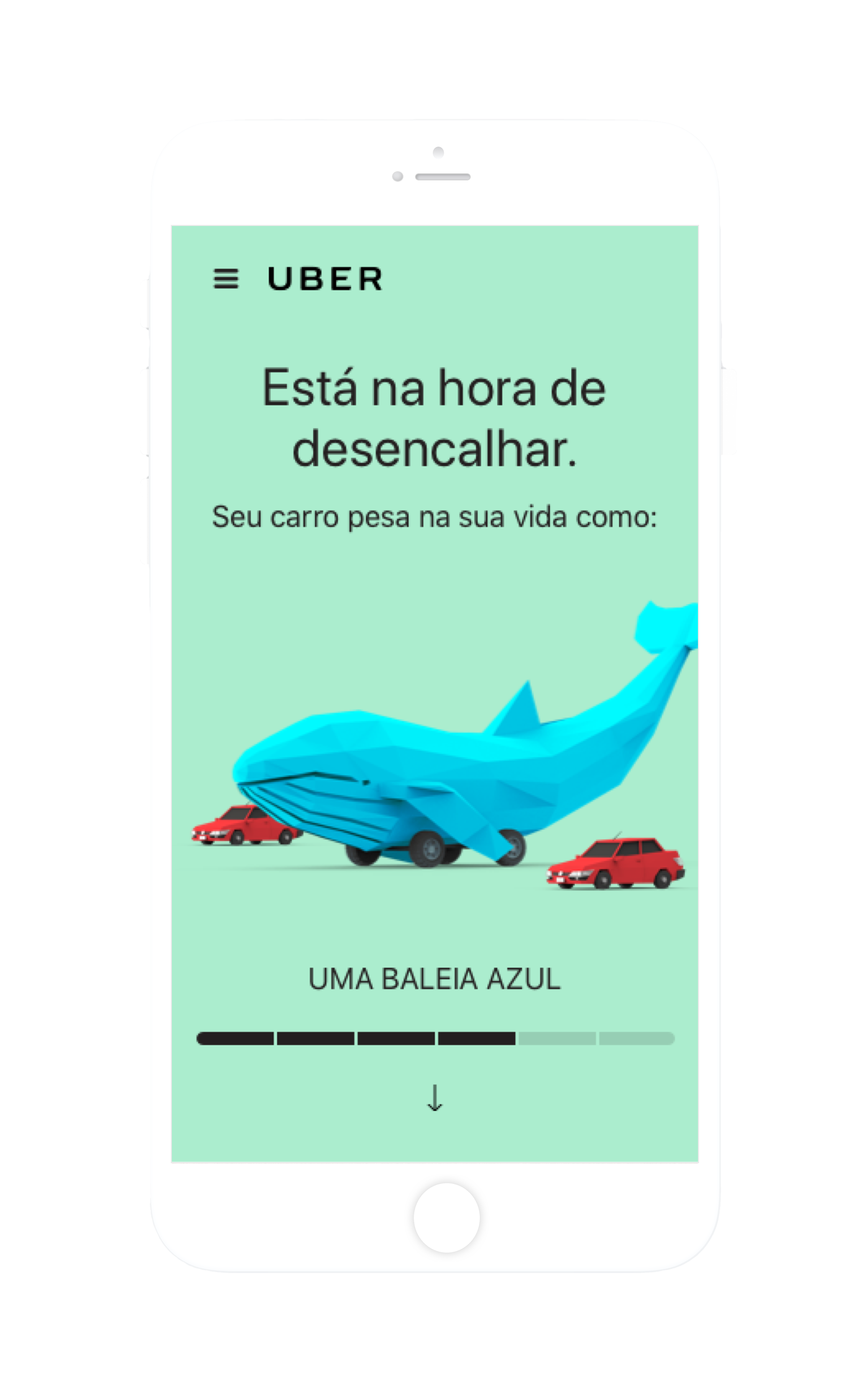
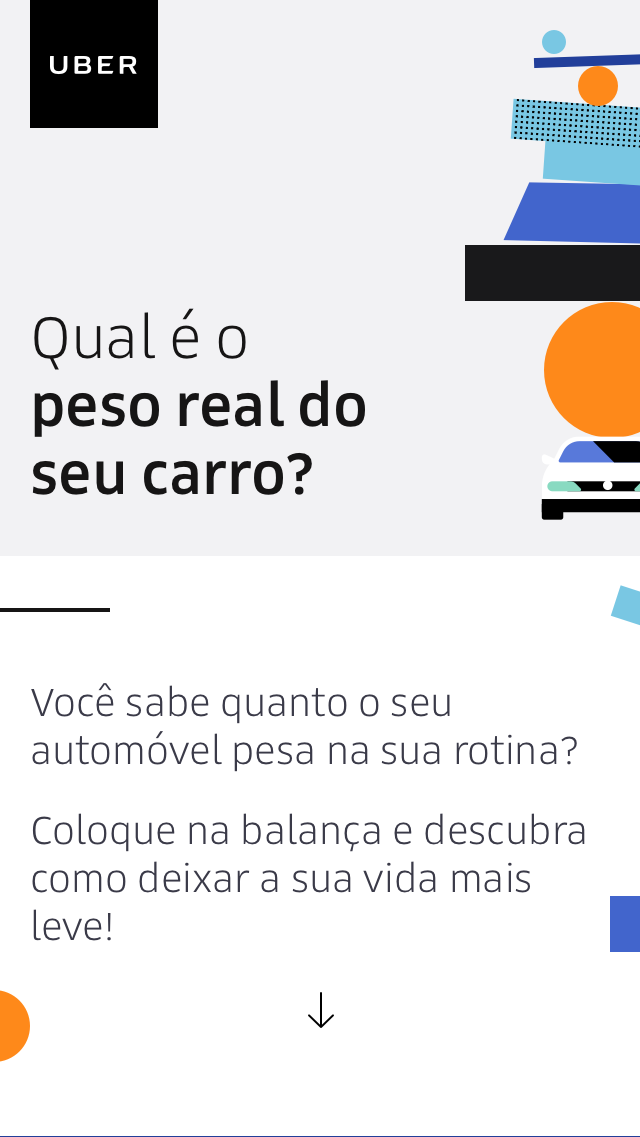
The campaign "O peso do seu carro" for Uber Brasil consisted of an online test where it was possible to estimate how much a car "weights" on its owner's life. The goal was to illustrate, in a fun and interactive way, the necessary expenses needed to maintain a vehicle and, by doing so, draw attention to mobility alternatives such as Uber.

Why
Being a car owner can have a bigger impact than most people imagine, both financially and emotionally. A study published by Fortune indicated that personal cars are parked about 95% of the time. In Brazil, a survey by Ibope showed that a resident of the city of São Paulo who uses his car frequently spends an average of 3 hours and 9 minutes a day in traffic. If you are driving, that means spending more than 47 days a year in traffic, which directly affects people's quality of life. As exposed by Guilherme Telles, General Manager of Uber in Brazil, if the person is not behind the wheel, they can use their time in traffic to relax or work, either answering emails, preparing a presentation or reading a book and listening to music.
How
• Information architecture
• UI/UX Design
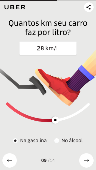
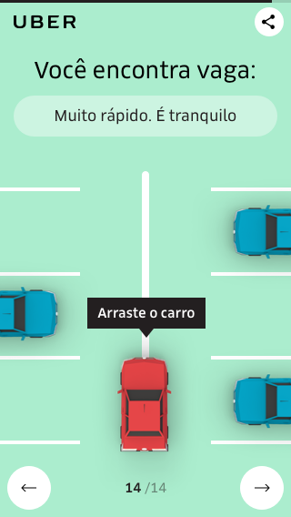
In collaboration with Moringa Digital's team, we created a calculator of financial and emotional expenses of driving a car. The result of the calculator based on a methodology that considered different quantitative variables such as the value of the vehicle, the distance traveled daily, expenses with maintenance, insurance, taxes and gas, and emotional aspects, such as the trouble of finding a parking place or getting stuck in traffic.
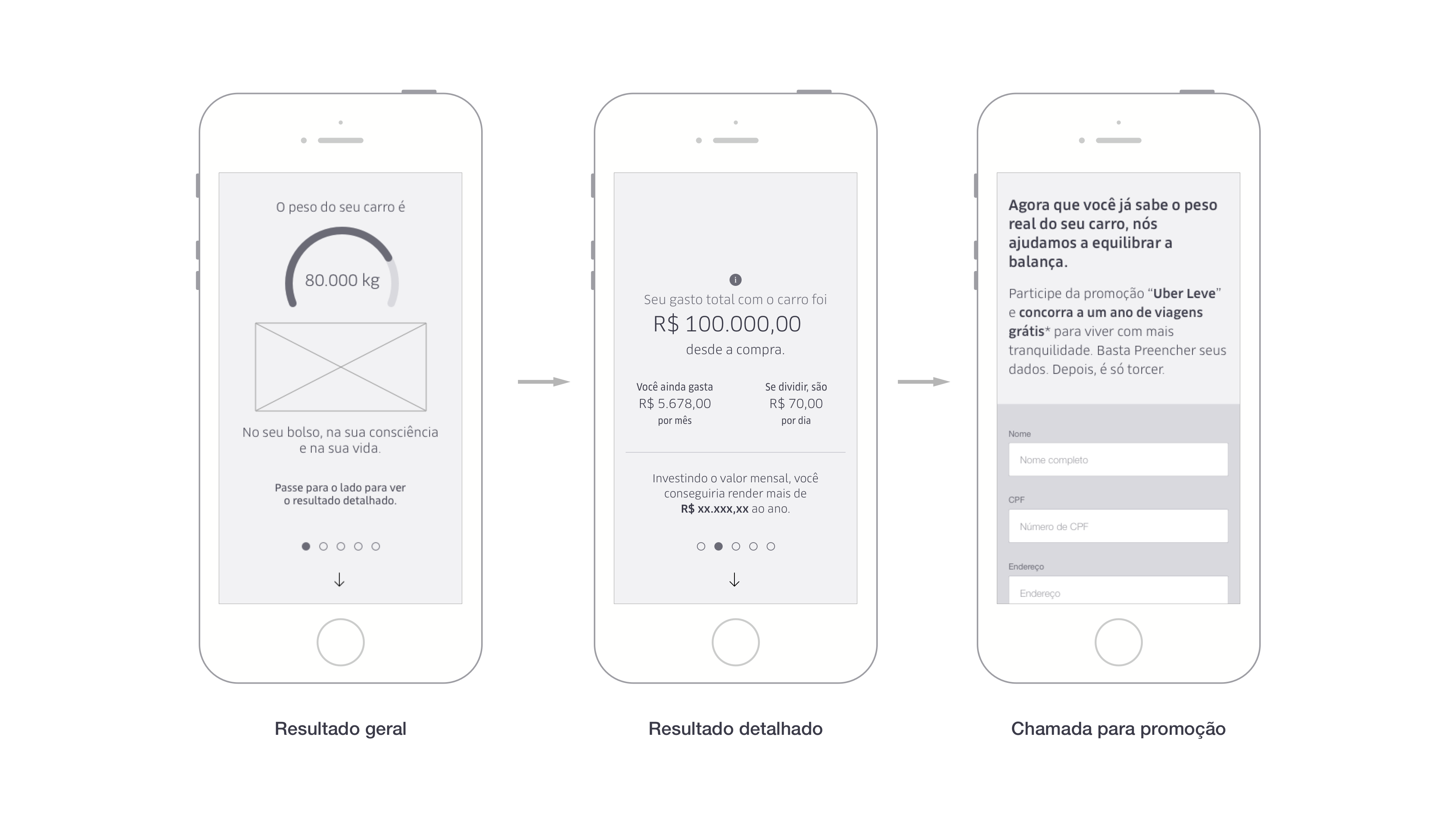
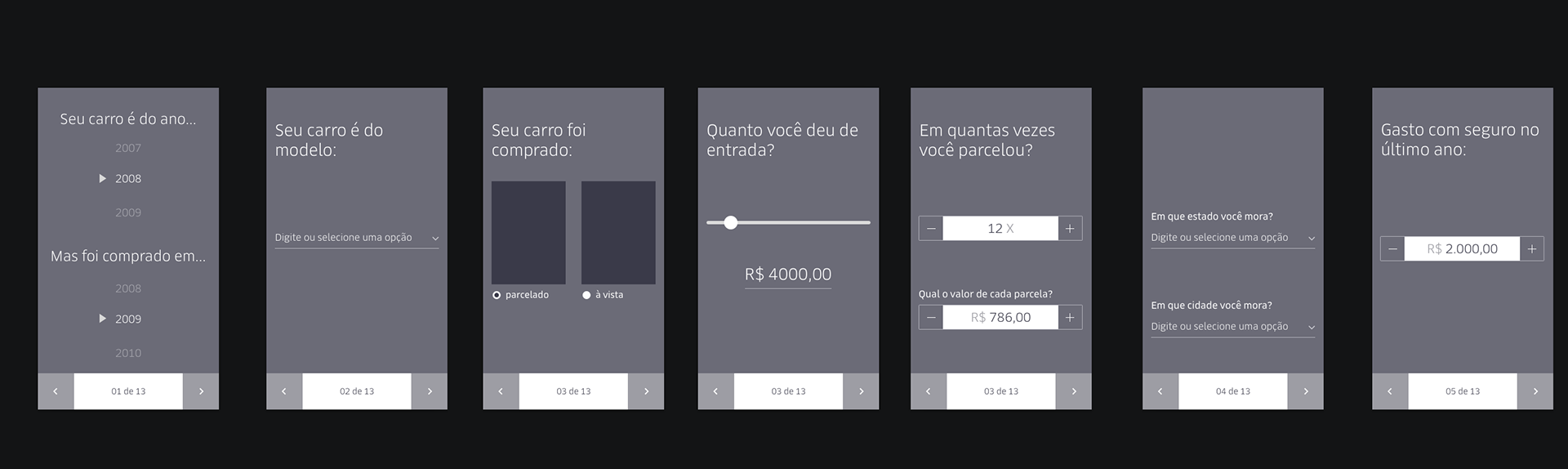
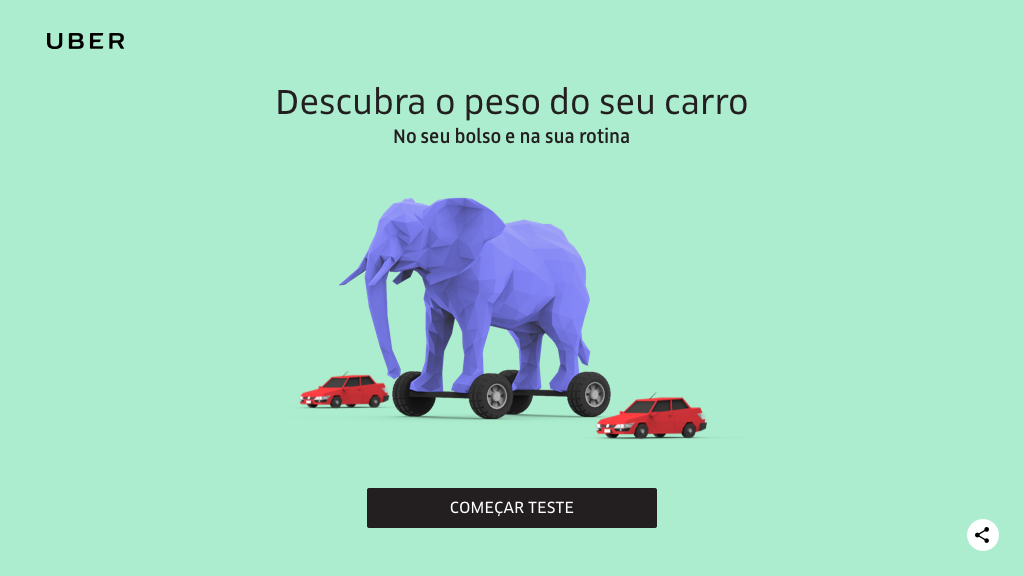
After choosing relevant questions to give meaningful results to the users, the team made brainstorming sessions to come up with the best solution to present the quiz. We explored some possibilities like the usage of a natural language form, but afterward, the team came up with an interactive step by step format that suited the project best. After answering all the questions, the calculator would give results, represented by a range of heavy objects, and a comparison between going by Uber versus owning a personal vehicle. The results would also show how much the user has spent on taxes and fuel since buying the car. We consolidate it in a low fidelity prototype to get feedback from the Uber team.
First iteration of the calculator form

First iteration of calculator results
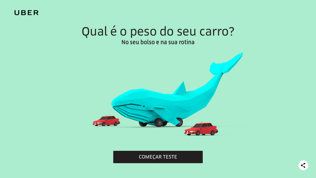
Final step-by-step format of calculator
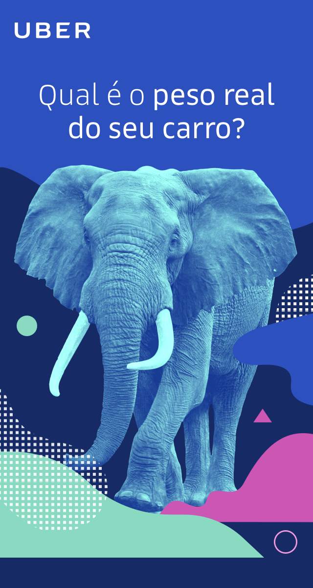
The next step was to define the visual identity of the campaign. We were challenged by the Uber team to disassociate from the institutional illustrations and bring something different visually. After many iterations, we established the visual identity as low poly 3D illustrations. The quiz was illustrated by Wallison in Cinema 4D, with 3D elements that would react to the user's answers, making it a unique experience.
Some of my visual explorations made for the campaign

Final visual with low poly 3D illustrations
At this point, I was able to apply the 3D illustrations in the layout, thinking about aspects of navigation, mobile touch targets, and interface interaction, following Uber's interface styles and guidelines.
After some rounds of feedback and adjustments, the layout was ready for development. I was able to support Moringa's front-end developer providing and exporting assets while helping to come up with solutions for occasional technical challenges while also giving feedback for animations and UI behavior.