2020
TEAM
Isabella Barbosa – Information Architecture & UI Design
Alex Lana – Front-end Developer
Isabella Barbosa – Information Architecture & UI Design
Alex Lana – Front-end Developer
UI Design · 3D Modeling
What
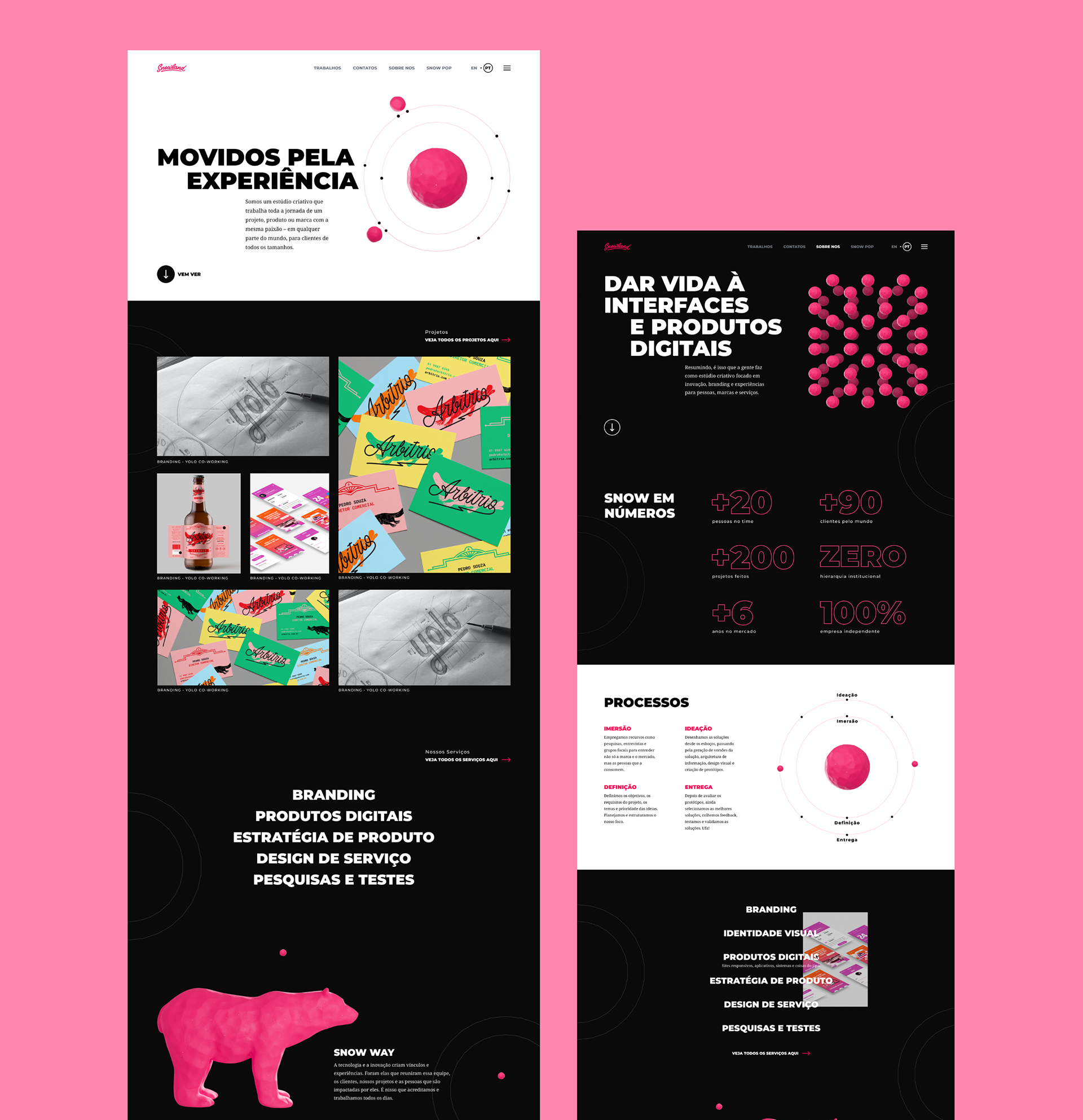
Snowland is a digital interaction and graphic design studio based in Brazil. It is an independent company with a very progressive mindset. In Snowland, there is zero institutional hierarchy, and employees are encouraged to embrace remote work and self-management. This project is the redesign of the studio's website.
Why
Snowland projects permeate within a wide range of the design field, going from branding identity to UX/UI design. Its new portfolio had to make Snowland services and personality clear and engaging for potential clients.
How
• Benchmarking
• Information Architecture & rapid prototyping
• UI/UX Design
In this project, my main challenge was to reflect Snowland skills and capabilities on their website. I started the project conducting a benchmarking on other company's portfolios to gather inspiration and create a visual moodboard.
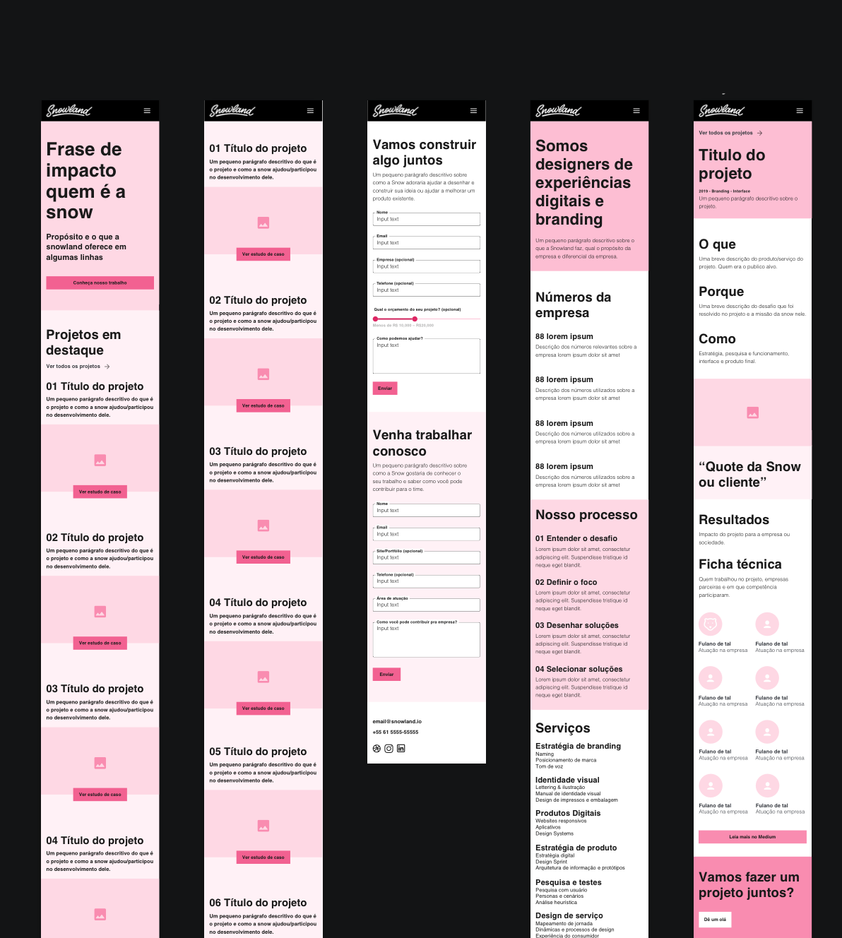
After this first step, I started to think about the areas that would be present on the website and their organization, constructing a wireframe and prototype so I could discuss these ideas with Snowland coworkers and make some adjustments based on their feedback.
Early wireframe study
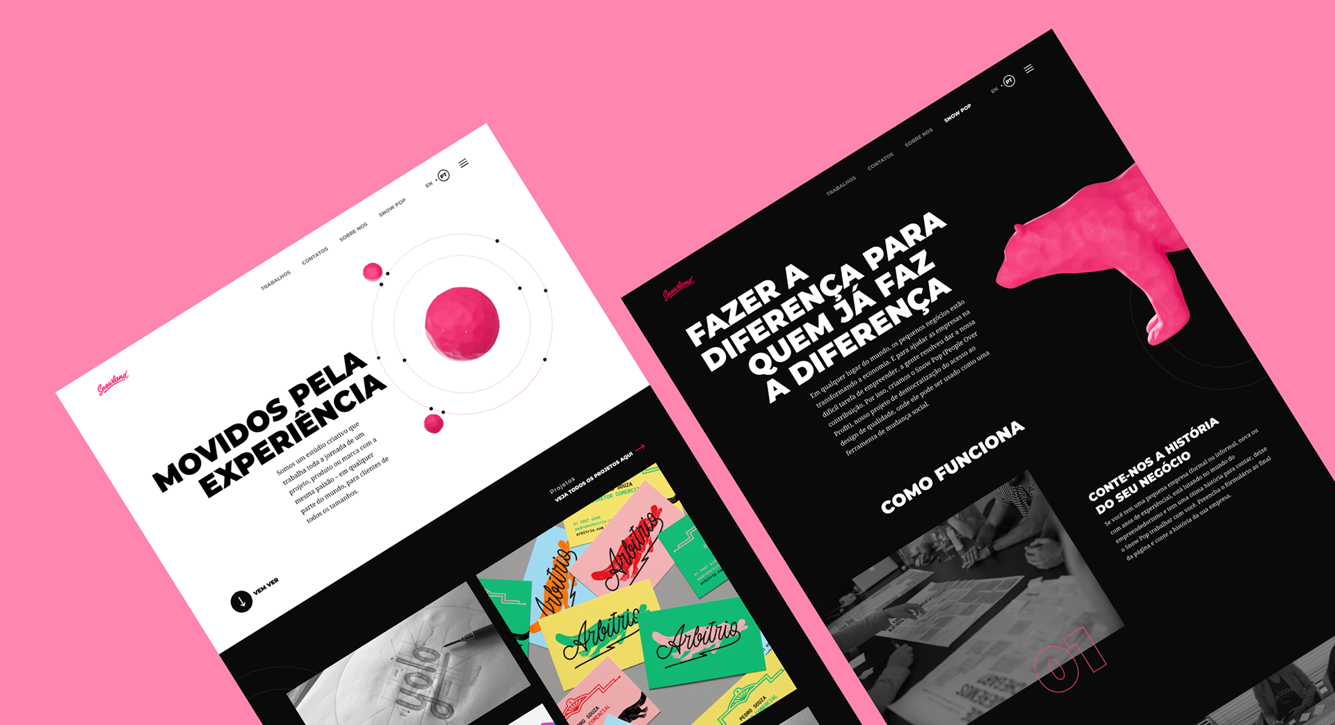
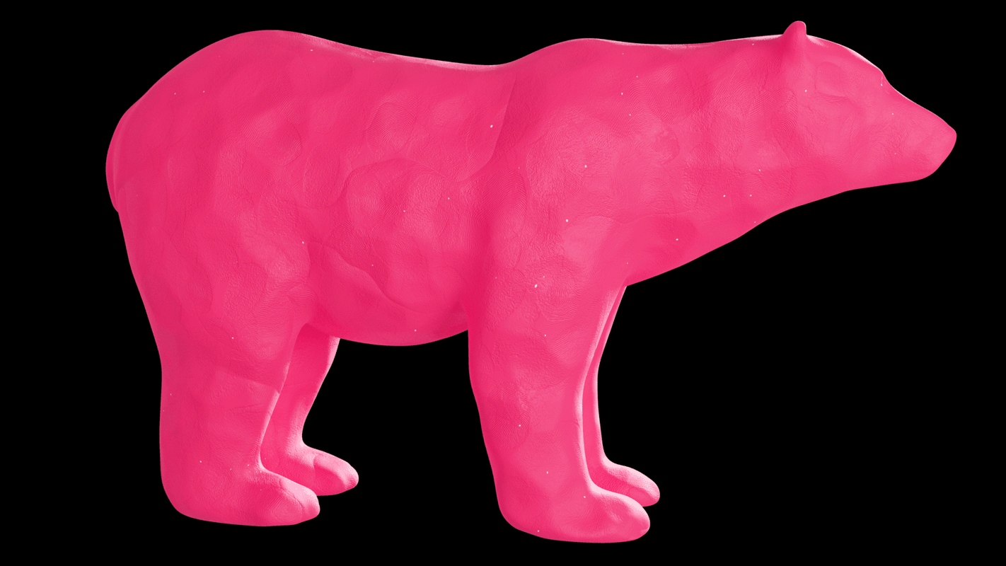
On the project's next phase, I started to come up with a visual concept to work with on the website. Snowland's mascot is a pink polar bear. However, it was scarcely used on its previous website. On Snowland's new website, I tried to use and incorporate the polar bear and the snow more prominently, both figuratively and abstractly.
Thinking that snow is water, but in another state, I opted to explore the water molecule and its different forms as my main concept/inspiration. Water molecules also have interesting characteristics: They are polar and bears this word in common with the Snowland's mascot, the polar bear. Because of this polarity, water molecules can attract one another and stick together, thus forming water and ice, with all of its familiar properties that are so important to life on earth.
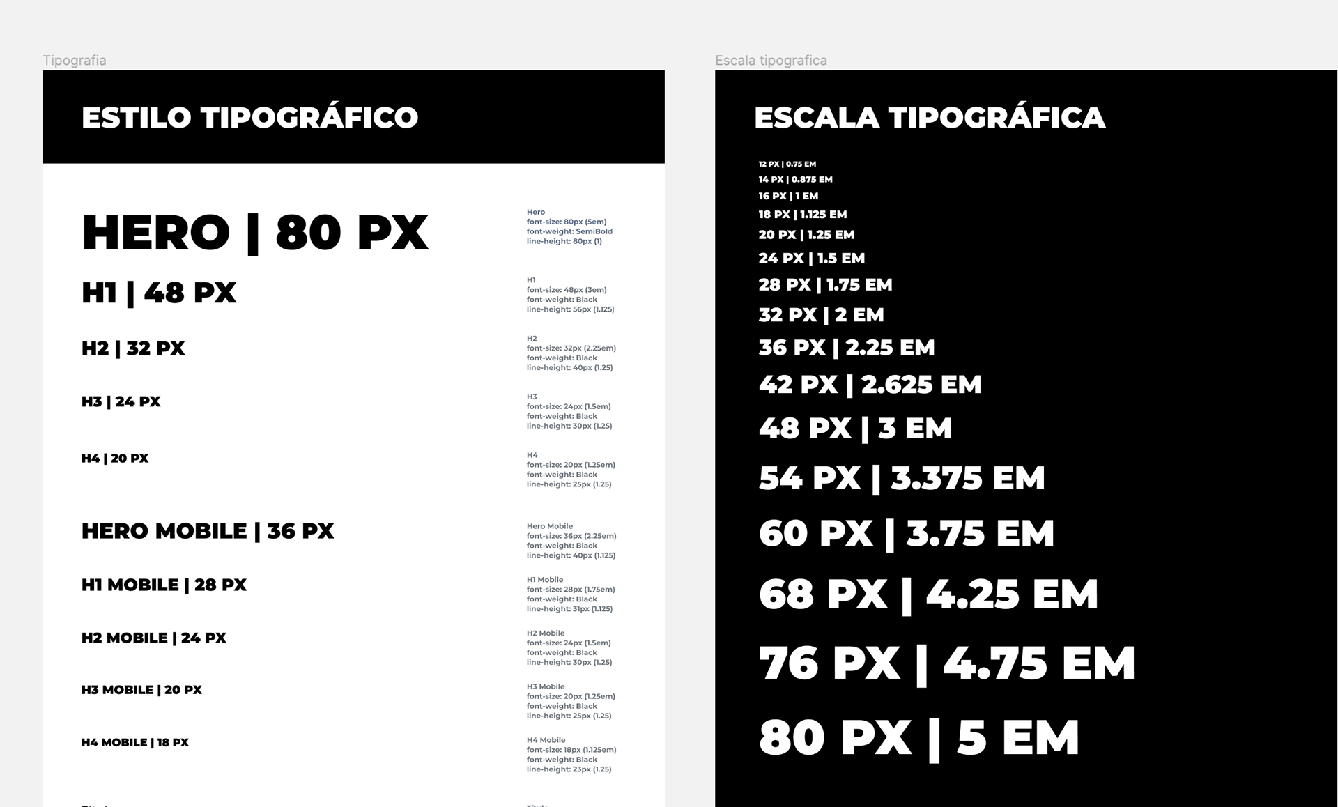
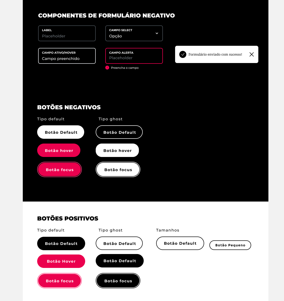
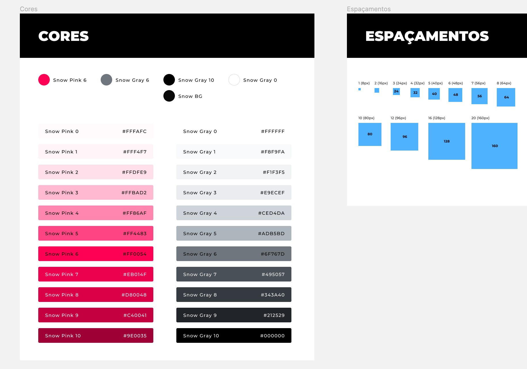
After coming up with the concept, I started to document and create some interface elements (like forms and buttons) and establish a typeface hierarchy. All UI colors for text and backgrounds were made with W3C accessibility contrast guidelines (level AA) in mind. The sizes of typeface and interactive elements were also carefully chosen based on best UI practices like mobile touch targets and readability.
Typographic scale and styles defined and documented in Figma
For the header, I user Blender 3D to create a stylized water molecule animation that represents more abstractly the movement and the experience on the "driven by experience" headline. On Snowland's new website, I tried to incorporate the pink polar bear more prominently, some time unexpectedly, like the paw going up on the hover of the contact button on the bottom of the page. All the 3D elements used throughout the website were customized to resemble a modeling clay dough with fingertips impressions in a stop motion style, representing the human touch and presence of the Snowland team.
Animation created in Blender 3D of stylized water molecule
Playful interaction with contact button